The Evolution of The Terminal>>June 8, 2018
It’s been two months since we first announced The Endless Mission. Since then, we’ve made a lot of progress with The Terminal — our hub world — and thought we’d share some highlights of how it’s evolving!
Concept Artwork
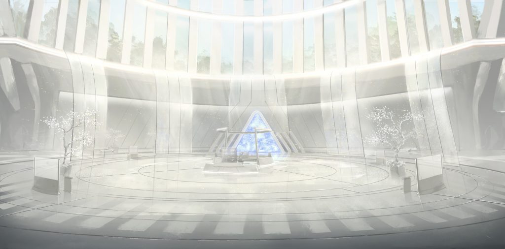
First, let’s take a look at concept artwork that captures our end goal. The Terminal’s aesthetic is extremely bright and almost ethereal with lots of natural light streaming in through the windows and transparent glass.
Pre-Alpha
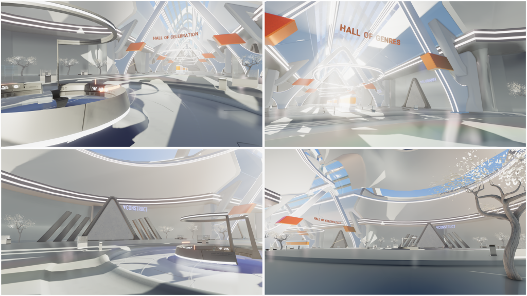
When we announced The Endless Mission, the Terminal was still early in the development process. In the images below, you can see elements starting to take shape such as the construct area gate and the trees, but note that the lighting and shadows are quite a bit darker and harsher than where we’re heading. There’s a glass ceiling but we’re still missing the tall, narrow windows that wrap around the entire building.
Alpha
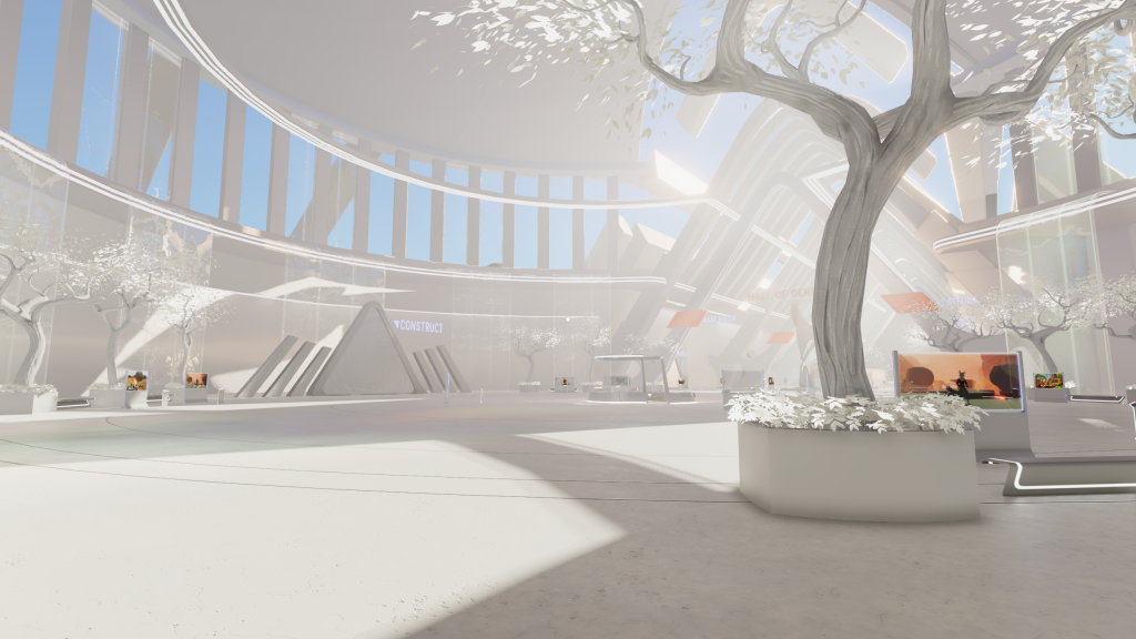
In its current state, you can see we’re a lot closer to the look and feel of the concept art. For this most recent update, we made changes to three key areas:
+ Architecture
+ Lighting
+ Custom Shaders
Architecturally, perhaps the most striking additions are the windows above the central area and the cascading windows. These windows let in a lot more “natural” light and in turn create bounce lighting which substantially brightens up the scene.
We also added a statue at the front of each of the halls. The custom translucency shaders for these statues afford a small amount of light to shine through them — this serves to illuminate the object itself and also adds to the overall lighting in the scene.
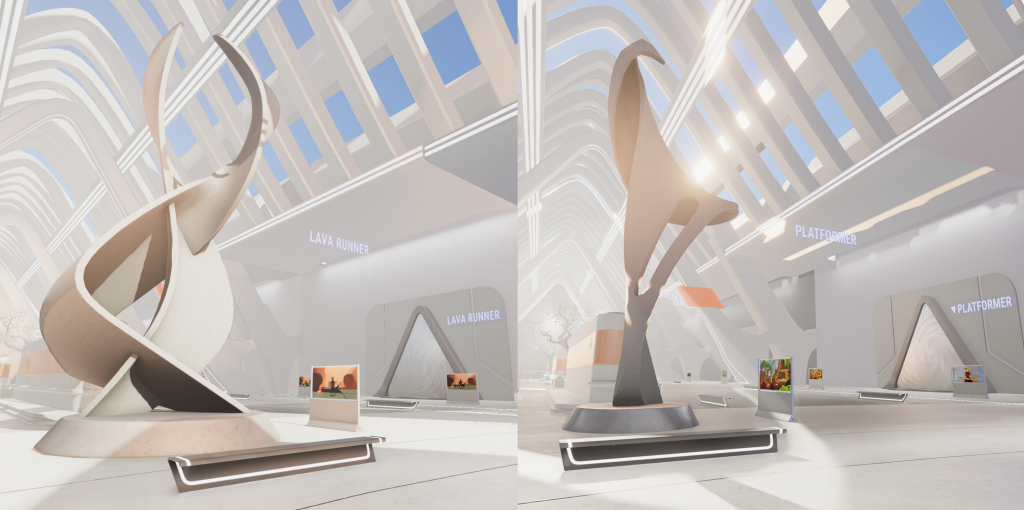
Additionally, we refined our light baking process to accommodate the new architecture and simulate more accurately how the lighting bounces off of the direct surfaces to illuminate the darker areas.
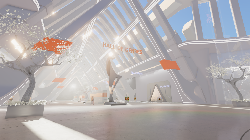
We’re really happy with how The Terminal is coming along and this is just the beginning…
Got questions for us? Leave them in the comments below or hit us up on Twitter!
BACK TO DEV BLOG
